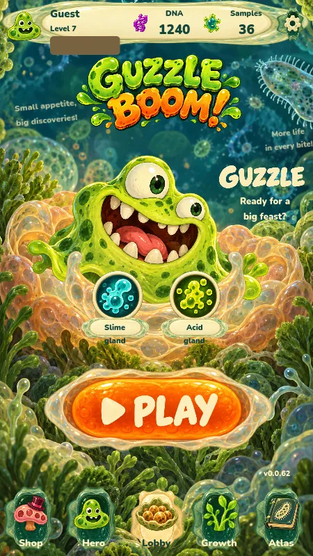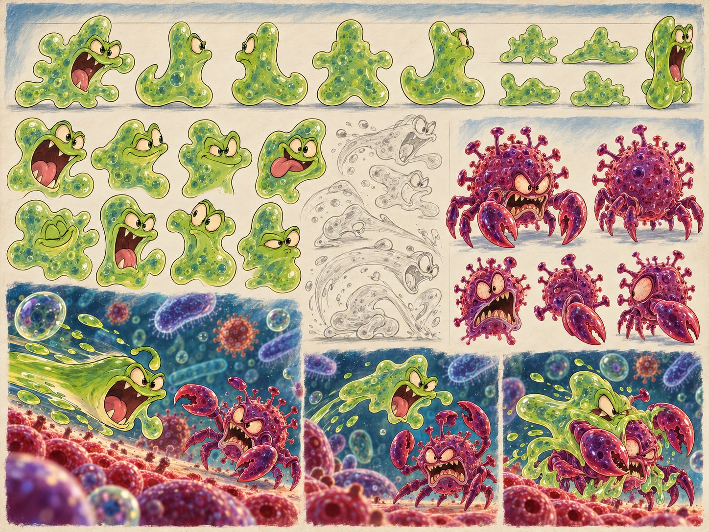
On a phone, Guzzle has another opponent: everything else we want to show. Satiety, abilities, warnings, the bite button, the hero, and the nearest threat all compete for one small rectangle. Adding a new mechanic is usually easier than making a clear place for it.
That became especially clear after we shared the game with friends. We asked them not to hold back and to point out what wasn’t working. One of the answers was simple and uncomfortable: not everyone understood the skills and interface. What an author sees every day can gradually start to feel obvious. A new player doesn’t get months of your familiarity along with the install.
That’s why interface work happens alongside work on the actions. In the mobile pass and later work on Living Nest, we changed how speed is presented, along with prompts, development screens, and the overall visual design. The desktop build and the installed phone build don’t always match; a fresh screenshot by itself doesn’t mean an update has reached the device.
Speed needs an explanation
In one mobile stage, food began to grant a limited speed bonus: some lasted until the attempt ended, and some lasted only briefly. The bonus had a cap. This lets food make you faster while keeping an upper limit on acceleration.
A percentage and speed streaks along the sides appeared on screen. The streaks turn off when reduced effects are enabled. It matters that movement speed doesn’t automatically speed up boss timers, cooldowns, or all the audio. Otherwise, one serving of food would change too many different things at once.
The button shouldn’t hide the task
Controls need room for a finger and a clear separation between actions. Threats need space where you can see their wind-up and a safe way to move away. Those needs meet at the bottom of the screen, near the hero. So we have to check the interface on narrow screens, with larger elements and different control positions.
Translation takes up space too. An English label may fit where a Russian one starts to cover a neighboring element, or the other way around. Checking one language doesn’t validate the other. That’s why, in the post about the Patriarch, we show separate in-game frames for RU and EN.
A beautiful screen has to work with real data
The original small arcade game accumulated systems. We decided to deepen the microworld, which means the interface will need to explain more meaningful choices. That’s no reason to bury someone in yet another tutorial screen. It means choosing the moment more carefully: when a short prompt is enough, when there’s time to open a card and read it, and when the hero is already flying into danger and it’s too late to read.
Living Nest was brought into the real menus, tree, dialogs, and tutorial. Profiles can have different values, available organs, and states. The screen has to handle them while keeping the main actions visible. An image with hand-picked numbers shows the direction, but doesn’t finish the work.
The most useful check is simple: can the player see what they need to respond to right now? We judge the look, button size, label, and effect by that question. A small screen doesn’t call for a small game. It calls for more care in choosing what deserves attention at each moment.